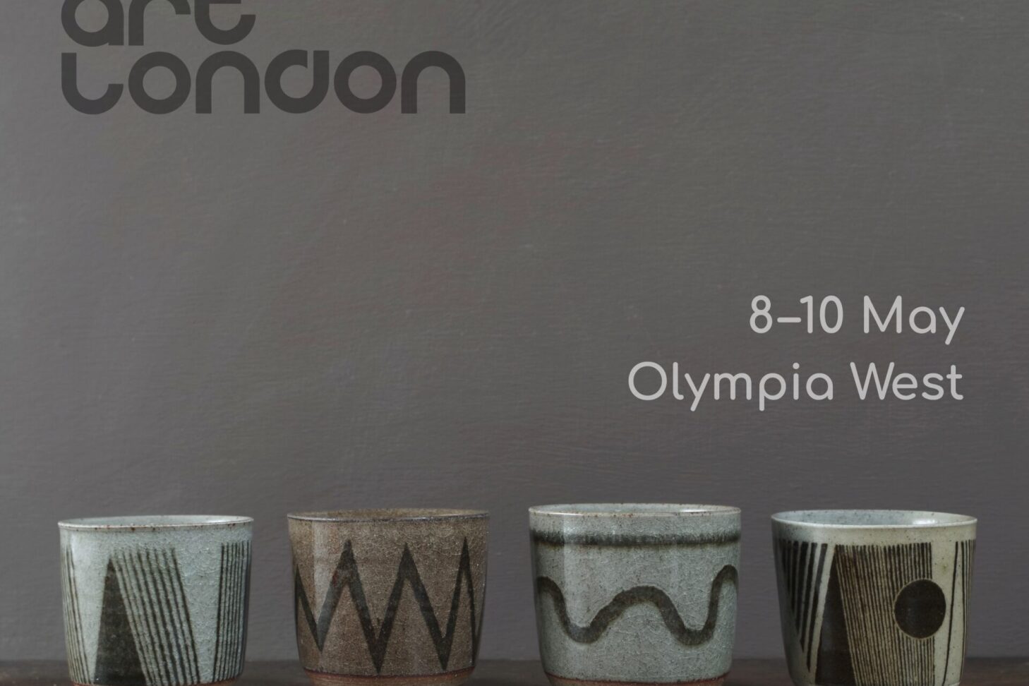
Category Archives: blog

Following the opening of our exhibition last week, James and I will be at Contemporary Ceramics in London again next week on Wednesday 13th March for a discussion with Sarah Griffin.

Contemporary Ceramics, 63 Gt. Russell Street, London WC1B 1BF

Sarah is an independent writer and curator specialising in Ceramics and Craft with a background in modern and contemporary art. She has taken a supportive interest in our work for many years so we were delighted by her suggestion of a Q&A to co-inside with our exhibition.

Sarah Griffin


We don’t know what Sarah will ask us  – it will be unrehearsed, spontaneous and informal. The event will take place at Contemporary Ceramics, 63 Great Russell Street, London WC1B 1BF at midday.

This is a free event and open to all, however space and seating in the gallery is limited. If you would like to attend this event please RSVP to the gallery on the email link below, stating your name and that you would like to attend this event, then await confirmation that your place has been secured.      info@contemporaryceramics.uk

We hope to see you there!

James and Tilla Waters

At the end of the month we will be in London to open our first solo show. The exhibition is at Contemporary Ceramics . The Opening is February 28th (6 – 8 pm) and the exhibition closes on March 23rd.

Here are some of the pieces which will be exhibited.

dark clay lidded jars with sgraffito decoration. 11cm, 15cm

I have always loved sgraffito as a decorative technique and seem to have a bit of a thing for zigzags. The jar on the right is an example of a kind of decoration that I call paperfold. Here are a couple more examples on bowls …

bowl (approx 24cm dia) with paperfold decoration

bowl (approx 24cm dia) with paperfold decoration

I find the fineness and precision of doing this kind of decoration totally absorbing and am intrigued by the potential for trompe l’oeil …

… but have also been enjoying experimenting with a much freer way of decorating …

large breakfast mugs with brushed oxide decoration

square (8 x 8cm) mugs with brushed oxide decoration

small (350ml) teapot with brushed oxide decoration

You may have noticed that some of the above were made using darker clay … we also really like it  under coloured, transparent glazes …

medium (850ml) teapot with dark clay and chun glaze (detail)

breakfast mug with dark clay and copper red glaze

There are lots of smaller pieces, like teabowls …

teabowls glazed in soft yellow and tenmoku

and beakers …

beakers with oxide decoration and clear glaze

and plenty of teapots (James is particularly fond of this little one).

small (300ml) teapot with satin glaze

I hope you’re tempted to visit our exhibition. If you can’t come in person, Contemporary Ceramics have an excellent selling website where all the pieces will be listed and going live shortly after the exhibition opens.

There’s also a lovely article about us in the current issue (326 March / April 2024) of Ceramic Review.

Thank you so much for subscribing, reading and taking an interest in our pots!

Tilla x


This week we had a bit of a sort out in the store room… and decided to add quite a few pots to the sale section of our website. Here are some of them. We haven’t quite finished sorting so I dare say there’ll be more joining them next week. Thanks for subscribing and I hope you find a nice bargain! xT

Raw glazed vase. 11cm. Was £65 now £50.


Decorated breakfast mug. Was £60 now £45.

Decorated breakfast mug. Was £60 now £45.

Large lidded jar. Was £180 now £120.

Small decorated pourer. Was £60 now £45.

Decorated beakers and pourer. Were £40 / £60 now £30 / £45.

Who else is currently making tableware in the UK? On Tuesday I visited Ruthin Craft Centre in North Wales, curious to see our work alongside 21 other makers, many of whom I hadn’t been aware of.

First, I must say that the Craft Centre itself is a joy to be in. It is modern, well designed, spacious and peaceful with good toilets and café. Being in a stunning rural location makes it a destination venue – I was amazed by how many cars were in the carpark on a snowy January Tuesday.

On entering the exhibition in the main gallery my excitement became tinged with anxiety. The hushed, reverential atmosphere, soft lighting, white walls and plinths gave me a kind of stage fright. I sought for reassurance in our work – which I found – it was displayed well and looking good.

Our work, with tableware by Alistair Young and Lowri Davies behind.

In my head, the exhibitors fell into two categories: the makers we know, with whom we’ve found warmth and familiarity through exhibiting alongside at events like Ceramic Art London and Origin over many years. We’ve shared highs and lows and bought eachother’s work.  That era is over for us now, and I suspect irrelevant for the next category  – the younger potters who’s shop front is Instagram and who need to engage their followers; to be as good at taking pictures and reels of their work as they are at making it. But that division ebbed away when I spent time with the work, saw and felt the commonality of clay and making by hand.

The different roles played by materials, expression, functionality and skill are evident in every piece, but the relationship between them and priority the maker gives them vary hugely, resulting in rich diversity.

Several makers favour tactile, matte surfaces; either by leaving the clay body unglazed (Sue Pryke, Alistair Young, Julija Pustovrh, Sasha Wardell, or through the use of matte glazes (Jono Smart, Borja Moronta) and some makers enjoy the contrast between glazed and unglazed areas (us, Pete Bodenham, Jaejun Lee, Bert Jones, Derek Wilson).

Tableware by Bert Jones

Tableware by Peter Bodenham (foreground) and Chris Keenan.

Surface decoration was joyful in the work of Irena Sibrijns and painterly – almost Fauvist – with Lowri Davies; sensitive and strong in David Stonehouse’s work.

Tableware by Borja Moronta and David Stonehouse in the background.

Tableware by Jaejun Lee and Pottery West.

Tableware by Jono Smart and Charlie Collier


I was disappointed by the “Do not Touch” signs everywhere. I can understand that the gallery have to protect against damage, but the physicality of tableware is so important to me that it felt a bit like going to a restaurant and not being allowed to eat. I did handle some of the exhibits whilst chatting with the gallery director and made some interesting discoveries: the decoration on the bases of Irena’s pots is more restrained and more lovely than on the parts you’re supposed to see… Bert Jones is an awesome thrower and his handles feel great…  the semi-matte glazes of Jo Davies and Pottery West feel waxy and seductive.

It’s now several days since my trip to Ruthin and I am still not sure what to think of it. On one hand it’s wonderful that well made, handmade tableware is held up for appreciation, the breadth of approach and outcome highlighted.  I found the exhibition fascinating and am delighted to be included in the selection… but the non-domestic, non-touching, gallery context cannot reveal the true comfort and beauty of a functional object, any more than images of a loved human can reveal their inner-beauty.

The exhibition is on until April 16th.


If it feels like a while since you’ve heard from us that’s because it is… it’s just over two years since my last newsletter. Why so quiet?

We’ve had plenty of news but none relating to our work, other than questioning its future. My last entry, (Diverse Decoration September 2020) reads as a retrospective, looking back at our work over the last twenty years and celebrating it… somewhat wistfully. We have had an unwanted, prolonged break from making which has been difficult. We have had to turn down orders and opportunities; reduce the number of galleries we supply to just two (Contemporary Ceramics in London and The Art Shop and Chapel, Abergavenny). We’ve had to be slow to complete commissions and are hugely thankful to all of you who’ve been patient and continued to buy our work, helping us keep things ticking over.

Large decorated teapot, part of a commission from 2021.

Country Living Magazine persevered and eventually persuaded us to be featured. Their lovely photographer, Eva Nemeth spent a couple of days here last November and even managed to coax a few smiles out of us! So, if you’re inclined, you can read a sweet, fuzzy article on us in the current (November) issue which is out now.

There’s a sense of gradual re-invention – James says he’s re-learning how to throw and wanting to throw better.

Freshly thrown teapot lids and spouts.

And with fewer pots available, I have brought greater intentionality to their decoration.

Unfinished lidded jars with zigzag decoration.

I have also resumed (after a thirty year break) my 2D work and am intrigued and motivated by the relationship between the two practices.


Drawing 10.03.22. pastel and pen, 50cm x 23cm.

You can see more of my drawings on Instagram @tilla_waters

Thank you so much for subscribing, reading, supporting etc. I hope it won’t be such a long gap next time.

I wouldn’t say that I have ever “hit the ground running”. I’m a slow burner; creative ideas take a long time to develop in my head, then take a long time to be realised, followed by lengthy periods of honing. As a result, our store room gradually accumulates experiments / prototypes / samples which for various reasons aren’t considered suitable for our website or any of the galleries we supply.

Usually we sell these “seconds” at our Open Studio in July, but of course, unfortunately, this year the event has been cancelled. We are all living differently, working differently and shopping differently, and so now (although they are sort of work in progress) my first generation brooches are available on our website shop.

#8 yellow sqaure. Length, 7 cm.

I’m new to making brooches but old to working with clay and have found the combination of novelty / familiarity very favourable to creativity. Somehow it’s easy to be playful.

Some potential brooches, at greenware stage, before being fired.

I have many unanswered questions like “are they nicer glazed or un-glazed?” and “which shapes do I prefer: straight or curved edges?” The answers will probably come through making more. At the moment it doesn’t matter, I just need to put in the hours and let them evolve.

#17 piano. Length: 5 cm.

#1. Length approx. 4 cm.

#9 length approx. 4.2 cm.

I would love to come up with a more elegant solution to the backs. I have used commercial brooch backs and araldite: strong and practical, but amateur.

brooch backs.

I will give half of the proceeds to the mental health charity, Mind. I’m aware of the huge strain lots of people are under at the moment, including our youngest daughter who had been recovering from anorexia but is now back in hospital.

My brooches have been joyful light relief for me during lock-down; I hope you’ve enjoyed seeing them.

Thank you for subscribing, reading and buying our work.


Like buses, three exhibitions have come at once! But they are at very different venues and are showing very different kinds of work. From quiet, functional work for every day use at Ruthin Craft Centre to dramatic one-off, titled pieces at the National Eisteddfod to bottles with clean forms and restrained surface design in Liverpool.

Aelwyd at Ruthin Craft Centre. Photo: Stephen Heaton

Aelwyd (Welsh for hearth) is an exhibition of contemporary domestic objects including a selection of our tableware. It is curated by Elen Bonner and runs until October 13th at Ruthin Craft Centre.

Very different work but still in North Wales; ten of our jug forms have been selected for this year’s National Eisteddfod in Llanrwst, Conwy which runs from August 3rd – 10th.

#114 transparency h: 23cm

We’ve made a new group of bottles specially for RE:Collected, an exhibition about collecting Craft at Bluecoat Display Centre, Liverpool which runs from August 3rd to September 14th.

Some of the bottles made for Bluecoat Display Centre, Liverpool.

Thank you for subscribing to our newsletter and reading my post. I hope you enjoy seeing examples of our work, either in the flesh at these exhibitions, or in image form on our website or on Instagram


My decoration seems to exist within a context of gradual evolution; nothing is ever totally new but everything is unique. For months on end I’m happy to repeat favourite themes and colours and then suddenly a new idea or colour occurs to me which prompts innovation. Recently there have been three new ingredients prompting quite radical newness!

  1. Squares. Squares are the new circles.

Decorated coffee cups. Diameter approx 7.5 cm

Decorated coffee cup (back)

2. Vertical (is the new horizontal).

Small decorated pourer (back).

Small decorated pourers. h: 11cm

3. Red (in moderation).

Teabowl. Diameter approx. 10 cm

Small decorated pourers h: 11cm

decorated stoneware coffee cup

I hope you enjoyed seeing my new decoration as much I enjoyed making it and thank you for reading / looking.


We always knew that making mainly functional pots by hand is not an easy way to make a living but we (somewhat blindly) trusted that, if we applied ourselves and were able to remain creatively engaged, people would like our work and we would do OK.

When we were contacted by the V&A last month about acquiring some of our work it felt like the highest compliment we could wish for. I was glad that they wanted decorated work (otherwise my input would have been tiny). They chose a teapot from our website shop and asked us to make a breakfast cup and pourer to go with it. This is the group:


I love seeing ceramics at the V&A – there are pieces I enjoy every time (Lucie Rie for example) but it’s such a vast collection that I always find fresh inspiration from previously unnoticed pots.

It’s slightly strange to think that  those pots will never be used – the teapot will never make a nice brew and the cup won’t touch anyone’s lips. But it’s great to think they could inspire future potters!

And thank you for supporting us – it means a lot!


This weekend we will be showing our tableware in Abergavenny as part of the Food Festival. There will be five other ceramicists upstairs in the lovely calm, light space of the Chapel.


These are some of my favourite pieces from the latest firings which we’ll be showing:

decorated beakers

decorated teabowl


medium teapot glazed in persimmon


medium bowl glazed in chun


and our ever-popular breakfast mugs.


The Food Festival is on Saturday and Sunday (September 15th – 16th) and the Makers’ Market is from 10am – 5pm both days. You can read more about the festival here.

There was a fantastic atmosphere there last year so do come if you can.

As Fine Art graduates, James and I are generally drawn to making functional things as a refuge from the complexities of Art. However, earlier this year we dedicated a period of time to making pots which are not intended for use. Some of them are already in a private collection and some are being exhibited at The New Craftsman Gallery in St. Ives.  The idea with this work is that in abandoning concerns associated with function (scale, weight, tactility, price etc.) we can adopt a more experimental, expressive approach, allowing each piece to exist purely on its aesthetic merits. People tend to ask us the following questions about them:

Why are they “jug” forms?

They evolved from un-glazed pourers. The purity of form in having straight sides and no handle seems to lend itself to more intense surface treatment. The narrower opening at the top emphasises the outside rather than the inside and the spout suggests front and back.

unglazed pourer with teapot. Height 13cm. 2013.


Why aren’t they glazed?

James throws them with coloured clay and I use pigmented slip (liquid clay) as paint. I want that surface to be exposed and clear – glaze would add another layer and the possibility of blurriness and shine which would obscure the surface.

“disappearing” (detail) h: 25cm April 2018


“all a blur” (detail) h: 43.5cm May 2018


What is going on with the decoration?

There are nearly always two opposing elements: controlled, organised marks (a grid of dots for example) and random physical marks (drips, splatters, scribbles). I like the idea of competition or tension between them and use colour to increase that. These two elements and the relationship between them provide a context in which to explore ideas and mark-making. There are certainly parallels with making paintings but the character of the jug form is my starting point and I enjoy the tricks and teases of its three dimensionality: for example, the way straight lines become curved as they wrap around the form; the way you can’t see the whole at once; the way it casts and catches shadows.

“blackbrownblue” (detail) h: 37cm April 2018


How does this work relate to your functional pots?

I don’t think this recent Jug Form work has prompted any immediate or obvious changes to  the way I decorate mugs and teapots but less functional pots (bottles, vases, teabowls) represent an interesting and welcome stepping stone between the two genres.


You can see the full catalogue of Jug Forms here.

Also, we are profiled (ten pages!) in the current issue of Crafts Magazine. Please note: we live in Mid-Wales (not North as the article states) and we do not intend to stop making tableware!


James and I are enjoying making bottles and I’ve been trying to put my finger on what it is about them that appeals. I think it could be that they were originally functional rather than decorative.

Historically, the material and form of the bottle would have communicated the contents as clearly as a label:  a blue glass “not to be taken” bottle; a chunky stoneware ginger beer bottle or a curvaceous green glass wine bottle. The contents were broadly signalled with the label adding details such as name and place. They were not intended to be decorative but had integrity, which we now find beautiful. Perhaps there’s a human parallel: authenticity and honesty being valued personal qualities today?


Finding beauty in the common-place is something artists have always done, but bottles have never looked the same since having become the subject matter of still life painter, Giorgio Morandi (1890 – 1964). I feel the of influence of his aesthetic every time I arrange a group of upright vessels or even when my gaze dwells on a group of pots and pans on the draining board. And a google Morandi search results in as many homages and imitations as genuine paintings…


which isn’t at all surprising considering how beautiful they are!

Morandi’s skill in painting vessels has provided a context for pots to be presented as Art. Here are some fine examples:

Akiko Hirai


Kirsten Coelho


Gwyn Hanssen Piggott, Cluster with purple beakers 2011


Edmund de Waal “Another Day” 2006


Here, an individual pot is a team-player and its physicality is less important than the shape / colour / tone / texture that it brings to the overall composition. The composition is static; the background and viewpoint prescribed. They are pots with three dimensions but translate incredibly well into 2D and have a Morandi-scented beauty.

Bottles seem to have been taken on a journey from utility to beauty. Like most pots, it is in their nature to form groups (the same cannot be said of teapots) and often the whole adds up to more than the sum of the parts.

Selecting and arranging pots into groups is fun (and we all do it whether it’s for a gallery; mantelpiece or a mealtime) but my final bottle stands alone, tall and proud: not remotely functional but charismatic and very beautiful.

Joanna Constantinidis bottle form c1970