Teapots have a special appeal for potters; it’s a challenge to unite all the parts into one harmonious whole. Teapots have just one function to perform – but it’s a demanding one.
And they seem to have personalities.
The teapots we’re making now are very different to our first ones…

2007. Decorated porcelain.
Note that there is colour on the knobs but not the feet of these rather curious beasts.

2012. Decorated porcelain.
We made the first generation of these for CAL (Ceramic Art London) and sold them all during the event. The grey / orange colourway became a favourite and the decoration here is intricate but confident. The spout is small and high to leave room for the decoration, without compromising function. The matt (black) details became something of a signature in our work during this period.

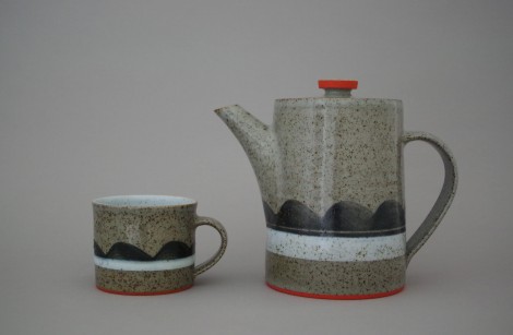
2013. Plain porcelain.
There is a satisfying contrast here between the crisp precision of the matt colours (foot rings and knob) and the soft fluidity of the glaze wave. In a way, this contrast highlights one of the most appealing aspects of ceramics for me: the control in the making stage and the unpredictability in the kiln. Our porcelain glazes had a fine, ethereal quality.

2013. Coloured stoneware / porcelain.
We were selected for the British Ceramics Biennial and made this tea set for it. We had been using un-glazed coloured clay for a body of non-functional work and wanted to feed the things we’d learned during that project into our domestic ware. I remember thinking it brought together the best of our skills: James’s making and my design. Its austerity is perhaps a bit out of place for something as homely / bourgeois as a tea set but we have used this teapot’s twin for years and become very fond of it.
2015. Decorated stoneware.
This one is something of a hybrid in having the red details (now I’d call it a hang-over) from the porcelain days combined with the more traditional earthy ruggedness of reduction-fired stoneware. The mid-tone of the clay body makes a nice “ground” for bold, tonal decoration – which I was applying entirely in rotation on the wheel – no circles yet!

2017. Plain stoneware.
Most of our work at the moment is plain: un-decorated and glazed in a single colour. We have stopped adding coloured details and like the quiet simplicity. This is our celadon glaze. It is fired in reduction and its colour comes from iron oxide. For me it has the right level of character – it is interesting in a subtle way.

2017. Decorated stoneware.
I’m torn between the calm simplicity of plain work and a deep seated urge to decorate things but I think I’ve reconciled the two pretty well here in this teapot which came out of the kiln a few weeks ago. The decoration is ultra pared-down and I’ve embraced the texture and colour offered by the raw, un-glazed clay body.
This blog post is an adaptation of a series of posts I published on facebook recently.
Thank you for reading and you can see more of our teapots here.
I took one look at these beautiful teapots and immediately started thinking about what teacosies I would like to knit for them, if only they were mine. Natural, undyed wools would suit the neutral coloured ones with some isolated red as the rug-maker’s ‘poison’. The banded decoration would lend itself to Fair Isle and the double dipping effect could be achieved using yarn double and slightly darkening the hue of the second yarn higher up the cosy. In my dreams. And what a travesty it would be to cover up the meticulous designs.
You sound inspired! What a great project it would be to design and make a teapot and cosy!
They are all lovely.
My favourite is 2013. but I always did like austere!
I now wish I drank tea!
Quite a journey.travel on Xx
We certainly will – thanks for the encouragement Sally!
I love my 2 J&T teapots.
Excellent! Thanks Sue.