Tag Archives: decoration

I wouldn’t say that I have ever “hit the ground running”. I’m a slow burner; creative ideas take a long time to develop in my head, then take a long time to be realised, followed by lengthy periods of honing. As a result, our store room gradually accumulates experiments / prototypes / samples which for various reasons aren’t considered suitable for our website or any of the galleries we supply.

Usually we sell these “seconds” at our Open Studio in July, but of course, unfortunately, this year the event has been cancelled. We are all living differently, working differently and shopping differently, and so now (although they are sort of work in progress) my first generation brooches are available on our website shop.

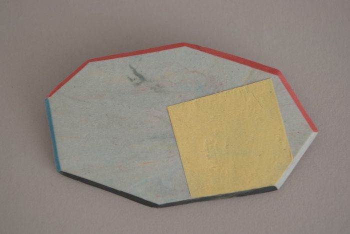
#8 yellow sqaure. Length, 7 cm.

I’m new to making brooches but old to working with clay and have found the combination of novelty / familiarity very favourable to creativity. Somehow it’s easy to be playful.

Some potential brooches, at greenware stage, before being fired.

I have many unanswered questions like “are they nicer glazed or un-glazed?” and “which shapes do I prefer: straight or curved edges?” The answers will probably come through making more. At the moment it doesn’t matter, I just need to put in the hours and let them evolve.

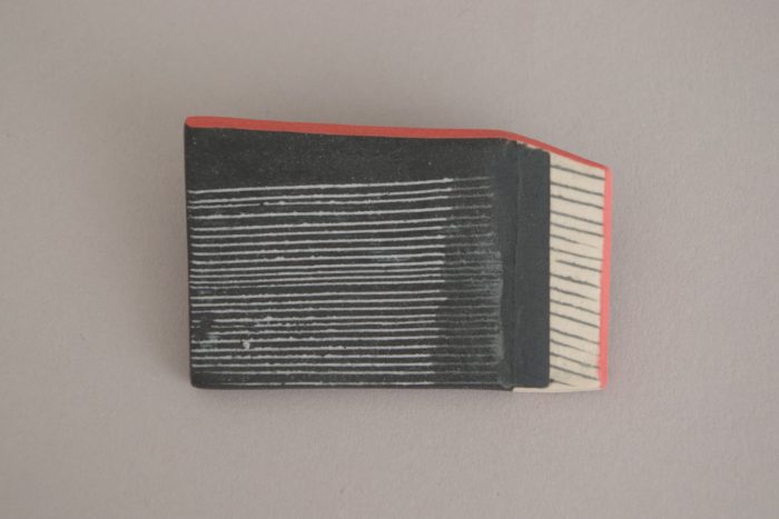
#17 piano. Length: 5 cm.

#1. Length approx. 4 cm.

#9 length approx. 4.2 cm.

I would love to come up with a more elegant solution to the backs. I have used commercial brooch backs and araldite: strong and practical, but amateur.

brooch backs.

I will give half of the proceeds to the mental health charity, Mind. I’m aware of the huge strain lots of people are under at the moment, including our youngest daughter who had been recovering from anorexia but is now back in hospital.

My brooches have been joyful light relief for me during lock-down; I hope you’ve enjoyed seeing them.

Thank you for subscribing, reading and buying our work.


Teapots have a special appeal for potters; it’s a challenge to unite all the parts into one harmonious whole. Teapots have just one function to perform – but it’s a demanding one.

And they seem to have personalities.

The teapots we’re making now are very different to our first ones…


2007. Decorated porcelain.

Note that there is colour on the knobs but not the feet of these rather curious beasts.


2012. Decorated porcelain.

We made the first generation of these for CAL (Ceramic Art London) and sold them all during the event. The grey / orange colourway became a favourite and the decoration here is intricate but confident. The spout is small and high to leave room for the decoration, without compromising function. The matt (black) details became something of a signature in our work during this period.


2013. Plain porcelain.

There is a satisfying contrast here between the crisp precision of the matt colours (foot rings and knob) and the soft fluidity of the glaze wave. In a way, this contrast highlights one of the most appealing aspects of ceramics for me: the control in the making stage and the unpredictability in the kiln. Our porcelain glazes had a fine, ethereal quality.


2013. Coloured stoneware / porcelain.

We were selected for the British Ceramics Biennial and made this tea set for it. We had been using un-glazed coloured clay for a body of non-functional work and wanted to feed the things we’d learned during that project into our domestic ware. I remember thinking it brought together the best of our skills: James’s making and my design. Its austerity is perhaps a bit out of place for something as homely / bourgeois as a tea set but we have used this teapot’s twin for years and become very fond of it.

stoneware cup and teapot by James and Tilla Waters


2015. Decorated stoneware.

This one is something of a hybrid in having the red details (now I’d call it a hang-over) from the porcelain days combined with the more traditional earthy ruggedness of reduction-fired stoneware. The mid-tone of the clay body makes a nice “ground” for bold, tonal decoration – which I was applying entirely in rotation on the wheel – no circles yet!


2017. Plain stoneware.

Most of our work at the moment is plain: un-decorated and glazed in a single colour. We have stopped adding coloured details and like the quiet simplicity. This is our celadon glaze. It is fired in reduction and its colour comes from iron oxide. For me it has the right level of character – it is interesting in a subtle way.


2017. Decorated stoneware.

I’m torn between the calm simplicity of plain work and a deep seated urge to decorate things but I think I’ve reconciled the two pretty well here in this teapot which came out of the kiln a few weeks ago. The decoration is ultra pared-down and I’ve embraced the texture and colour offered by the raw, un-glazed clay body.

This blog post is an adaptation of a series of posts I published on facebook recently.

Thank you for reading and you can see more of our teapots here.

plain and decorated pourers

plain and decorated pourers

When opening our twitter account last year, I gave very little thought to our bi-line, which reads,

“We are studio potters. Torn between love of purity and love of decoration. We’ve made quite a few mugs.”

I think I hit the nail on the head about being torn…

I love the purity of a single colour, the clean unfussiness giving full voice to the character of the glaze. Strong and resolved. The relationship between surface and form is easy; even with bright colours there’s harmony. There aren’t any awkward issues about matching / not going with / looking out of place. Plain glazed work almost seems to have the moral high ground; didn’t Michael Cardew say that a pot was 80% form and 20% decoration? The minimalism fits with a modern aesthetic, yet is classic – won’t ever look dated.

When visiting the V&A I’m always struck by the natural elegance of decoration on  pottery from Asia and the Middle East.

Iznik monochrome pottery dish Turkish C17th

Iznik monochrome pottery dish Turkish C17th

It can make me think there’s no point in even trying. And yet, I have a really strong desire to add decoration to our pots. I don’t think it’s just because I don’t make the pots and I want to leave my mark on them, but leather hard clay provides a fantastic ground for mark-making: brushing, sponging, carving and scratching all work beautifully. Although my strengths lie in surface treatment, I do enjoy working with the given form and pride myself on being able to avoid “wall papering”. And I think my decorative style has played a significant part in giving our work a strong, distinctive look.

However (this is the torn part) James and I have never found it easy to accommodate plain and decorated work side by side. We are most aware of the problem when selecting work for galleries and planning displays at craft fairs. We want to show the breadth of our range whilst also wanting coherence. The decorated work has a white ground (porcelain), which is unsympathetic to the plain colours. We separate them into two groups and each group is happier but the whole isn’t coherent. It’s a problem we’ve been aware of for years without feeling able to address… until now.

Over the last six months we’ve been wanting to move away from porcelain to something earthier and more characterful; a clay body that would lend itself to a more relaxed style of throwing for James and simpler decoration for me. So we’ve been trying out various stoneware clays and firing them in reduction. Below is a snap shot of the shelf in the workshop where we put the pots that we think are going in the right direction. And I can’t help thinking that the decorated pots are mingling happily with the plains.

new reduced stoneware range samples

new reduced stoneware range samples


People often ask how we design our pots. It’s easier to say what we don’t do: we don’t (usually) design on paper then translate into clay; we don’t (consciously) look for inspiration in nature. We prefer to say that they “evolve”…….which requires further explanation.

One of the things we like about throwing as a way of making is the flexibility it allows. If we decide to make a shape slightly bigger/smaller; straighter/more curved etc. then we can. Sometimes James asks for feedback on the first few freshly thrown shapes on the shelf and we might decide they need to be more like, say, the one in the middle. James keeps records of what he throws – the weight, the kind of clay and the dimensions when wet, so that he can return to preferred forms. This creates a “survival of the fittest” environment that is, in a way, akin to a process of evolution.

I consider James’ appreciation of form to be more finely tuned than mine, but I have the advantage of coming with fresh eyes. We usually agree on which shape we prefer; usually one simply looks more right than the others. We are keen that the pots should also be nice to use – which is a longer term test. We make a point of using the pots ourselves in the house. Whether or not we are drawn to use something in a real, functional context over an extended period of time is a telling test for any pot!

There is probably greater scope for innovation in my input with glazes and decoration. We are frequently trying out new glazes. Some of them don’t make it past the initial test tile stage, some of them are short-lived and some of them continue in production for years, with minor adjustments to the recipe along the way. Meanwhile, James hones his knowledge of the optimum thickness for each glaze and its optimum position in the kiln.

Decoration/mark-making/surface treatment has always been the part I love the most and shows the greatest degree of evolution.  Leather hard clay is a wonderful surface to work on allowing me the techniques of sgraffito, brushwork, inlay and stencil. Initially I imposed the rule that I would do only wheel based decoration – as a way of ensuring integration of form and surface. In the last few years I’ve broken the rule. I’ve felt confident that I can decorate with sensitivity to the form and use a combination of wheel and freehand decoration resulting in a more playful / quirky look.

The images of the pourers below span eight years. They show development in form, decoration and photography. We only photograph the pots we’re most pleased with, so each image represents our best version at the particular time. I find it fascinating to look back at the evolution and wish I had a crystal ball.


Pourers 2006

Pourers 2006

Pourers 2008

Pourers 2008 – introducing coloured feet.

Pourers 2011

Pourers 2011 – introducing non wheel based decoration but still with rotational symmetry.

Pourers 2014

Pourers 2014 – introducing the circle motif and the idea of a front or “face”.


decorated teapotsWe are busy making stock for CAL (Ceramic Art London). These are some decorated teapots drying before their first firing – looking promising but a long way off being “in the bag”. The functional demands on a teapot are obviously great which means they’re difficult to do well.

They should pour well, feel nice to hold; the lid fit well,  be light and balanced – and of course look good. They only have to fall short in one respect to be proclaimed a “second”.

However, if all goes well they could be one of our best products – James’ perfectionist attention to detail in the making and my surface design – that’s collaboration. Now we just wait with fingers crossed.

stoneware lidded jarsAfter a ten year break I’ve done some throwing. I started with flower pots in the Summer and have recently finished these lidded jars.

I wanted to give myself a challenge and was curious to see whether I would like the different character of my throwing. They do have nice qualities but I think my strength lies in surface treatment.

dec. espressoEspressos used to be the only mug shape we didn’t decorate – we assumed they were too small. But recently my decoration has become more graphic and minimal which seems to suit  a small scale. The four we’ve made are shown on the cups and mugs page, but this is my favourite one. I’m sure we’ll be making more.

Tilla October 26th 2013

BCB teasetsWe’ve finished the two teasets which we’re sending to Stoke for the British Ceramics Biennial. The one on the top shelf is mainly unglazed (“naked”) with minimal abstract decoration on coloured stoneware clay. The one on the lower shelf is porcelain, mainly glazed,  in three neutral colours.

We’re totally delighted with them – the naked set is dynamic and strong and the porcelain set is so refined and serene.

Tilla   August 29th

neutral colours
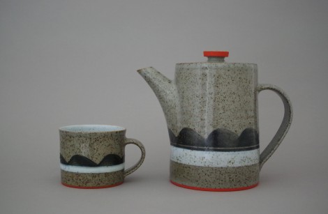
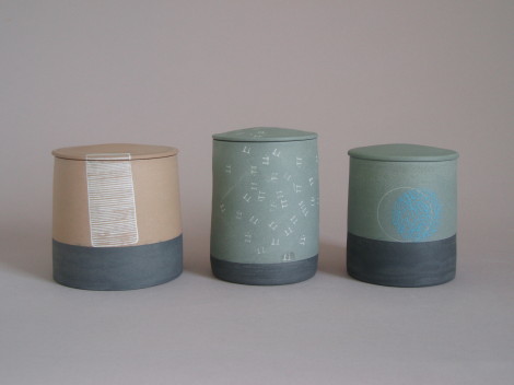
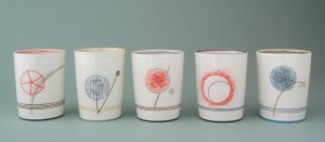
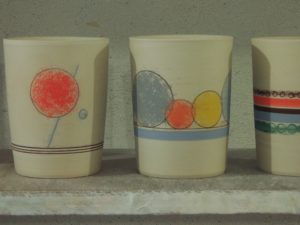
These are some pots we’re about to send to the Leach Pottery in St. Ives. Before they disappeared I wanted to record their nice quiet, neutral colours.
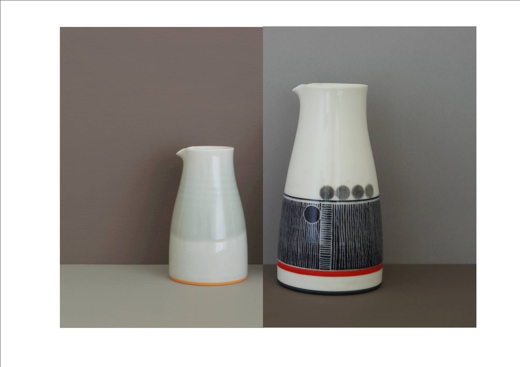
I particularly like the smaller decorated pourer and am looking forward to doing some more monochrome decoration.

Tilla   25th April 2013

decorated beakers 2Today I’ve been decorating beakers. They aren’t finished yet – they need to have their feet coloured and then be fired and glazed. I photographed them because I’m pleased with them but worried that they won’t look as good when they’re finished. All our work on the cylinders is beginning to influence  our functional work (the lack of rotational symmetry and the circles).

Tilla   21st March 2013